AnOther
Georgina Johnson


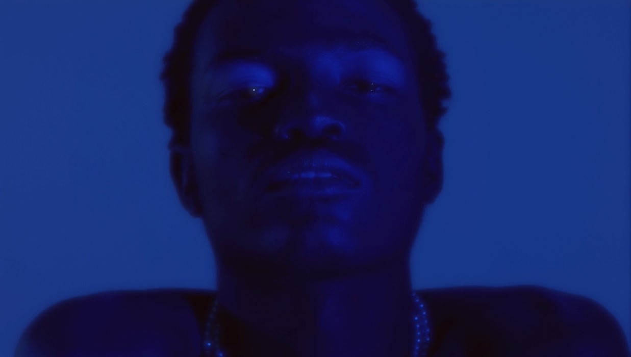
London-based designer Georgina Johnson is the founder of beloved womenswear brand Laundry Service and art programme The Laundry. Her work bridges the gap between fashion and moving image, with her latest filmic endeavour – titled Saint – The Empty Pose – commissioned by The Photographers’ Gallery as response to the institution’s current exhibition, Four Saints in Three Acts – A Snapshot of the American Avant-garde.
The film forms a part of Johnson’s interactive gallery installation and critiques the ground-breaking 1933 American Modernist opera Four Saints in Three Acts. The opera was renowned for its unconventional music, experimental narrative and its atypical all-black cast, who portrayed European saints, and were recruited from the choirs and nightclubs of Harlem. It was composed by Virgil Thomson with a libretto by novelist Gertrude Stein, and a choir led by Eva Jessye, the first black woman to receive international distinction as a professional choral conductor.
Four Saints in Three Acts defied the form, content and style of traditional opera. It showcased some of the leading names in dance, performance and design and was widely considered a radical piece of work for representing an intersection of racial, sexual, avant-garde and mainstream trans-american subcultures.
In conjunction with the premiere of Johnson’s self-directed and self-styled film, which features an original score and explores the themes, visual aesthetics and politics of the experimental opera, AnOther speaks with the young creative about her vision for the piece.
On the politics of the all-black cast…
“Much of the film is a response to and a critique of some conversations in a text I was given to read about the opera. My first thought was: ‘Why the all black cast?’ One of the first things that jumped out at me was reading that the costume director wanted to paint the cast’s faces white, because she was worried that their skin would clash with her colour scheme. This further reinforces how people of colour were thought of as disposable, and were there just to bring the pizzazz and be these smiling faces. I really wanted to put myself in the cast’s shoes. It became evident that the casting choice was based on the allure of the black aesthetic through the white gaze, and as I looked at the references and images from the opera, and although they were incredibly beautiful, I felt a deep sense of tiredness, which might only be a reflection of my feelings towards certain activities in the present, especially those that are engineered by people outside of certain communities. It felt reminiscent of attitudes that are being maintained in not only the art and design industries, but in corporate and social culture today. It’s nothing new. Which made something curl up in my stomach. But I was extremely excited to direct, style, design and build something that was motivated by that feeling and almost unearthing it.”
On the narrative…
“With the film, I interwove different themes and approached them with the question of ‘If I prayed to any saints, who would they be?’ Though an abstract thought, I considered the roles of the patron saints of serenity, power and reflection. Gertrude Stein spoke on a formative influence of hers that really resonated with my person, my process and approach to work. She spoke about a series in which an image of a young girl who is initially pictured in her everyday dress, slowly turns into a picture of a nun. This inspired a key moment in the film, in which Ayo, switching between a number of looks, gazes on an image of herself looking back at herself. Which for me, is a reflection of the relationship you have with your varying selves, and something I thought about when developing the story.”
On directing…
“I enjoy experimentation. I did a lot for this film. The directing, the styling, the casting, the set design and co-producing the sound. Directing is really interesting for me, especially because I don’t know the rules so I can just do what I like.”
On aesthetic choices and the colour blue…
“In my work, I always have a pull and push between an industrious worn-down pulled back textural aesthetic and something beautiful and luxurious. I took a lot of inspiration from what was described about the opera’s costume designer and her home and I guess the flair she had when designing the set. I like movement, fluidity and depth so played with that. I’m pretty particular about tonal quality. We used a lot of blue in the film. There’s a lot of healing properties in the colour blue, and something especially beautiful about blue light in different degrees. It ushers you to bed and wakes you up in the morning. It keeps you alert and is also really calming. I wanted the film to be as multi-dimensional. There’s a liveliness, a sense of contentment and at the same time, a nod to solitude – the kind you feel even when you’re in the presence of people. Which I think encapsulates the artist’s consecration to art.”